盒模型阴影box-shadow
box-shadow:[inset] x y blur [spread] color
| inset | 投影方式 inset:内投影 不给 :外投影 |
| x、y | 阴影偏移 |
| blur | 模糊半径 |
| spread | 扩展阴影半径 先扩展原有形状再2开始画阴影 |
| color |
1 |
|
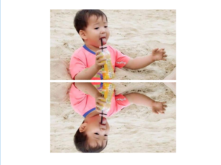
box-reflect倒影
| box-reflect | ||||
|---|---|---|---|---|
| direction | above \ | below \ | left \ | right |
| 距离 | ||||
| 渐变(可选) |
1 |
|
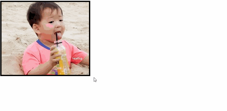
resize自由缩放
| both | 水平垂直都可以缩放 |
| horizontal | 只有水平方向可以缩放 |
| vertical | 只有垂直方向可以缩放 |
要配合overflow:auto来使用,只有水平方向可以缩放
1 |
|
box-sizing盒模型的解析模式
| content-box | 标准盒模型 width\ | height=border+padding+content |
| border-box | 怪异盒模型 |
1 |
|