新增颜色模式
| rgba | |||
|---|---|---|---|
| r | red | 红 | 0-255 |
| g | green | 绿 | 0-255 |
| b | blue | 蓝 | 0-255 |
| a | Alpha | 透明 | 0-1 |
例子:背景透明,文字不透明
text-shadow 文字透明属性
text-shadow:第一个参数表示x轴的偏移量 第二个参数表示y轴的偏移量 第三个参数表示模糊程度 第四个参数表示阴影颜色
阴影效果可以多层叠加,中间用,隔开
1 |
|

例子:层叠
1 |
|

例子:光晕
1 |
|

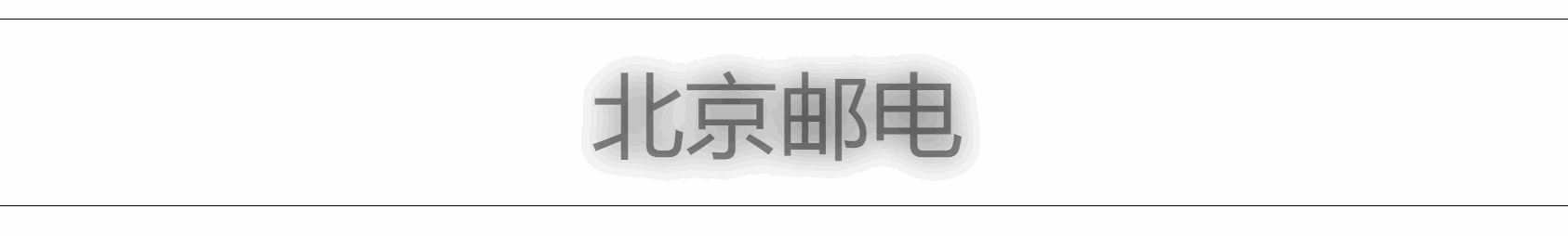
例子:火焰文字
1 |
|

例子:模糊效果
1 |
|
文字描边
只有webkit内核的浏览器才支持。-webkit-text-stroke:宽度 颜色;
1 |
|

文字排版
direction 定义文字排列方式
Rtl 从右到左排列
ltr 从左到右排列
注意要配合unicode-bili一块使用
1 |
|
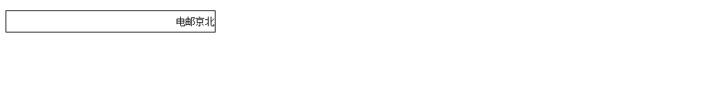
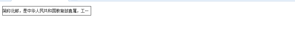
文本省略
text-overflow定义省略文本的处理方式
clip 无省略号
ellipsis 省略号
1 |
|
自定义文字
工具:asia font studio4
格式:
@font-face{
font-family:’isabelle’;
src:url(‘111-webfont.eot’);
src:url(‘111-webfont.eot?#iefix’)format(‘embedded-opentype’),
url(‘111-webfont.woff’)format(‘woff’),
url(‘111-webfont.ttf’)format(‘truetype’),
url(‘111-webfont.svg#untitledregular’)format(‘svg’);
font-weight:normal;
font-style:normal;
}
转换字体格式生成兼容代码: