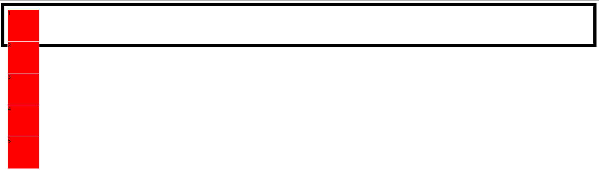
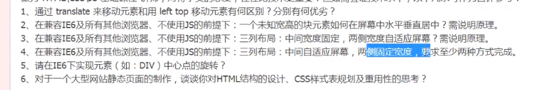
弹性盒模型
注意在使用弹性盒模型的时候,父元素必须要加display:box 或 inline-box
| box-orient | 定义盒模型的布局方向 |
|---|---|
| horizontal | 水平方向 |
| vertical | 垂直显示 |
| box-direction | 元素排列顺序 |
|---|---|
| normal | 正序 |
| reverse | 反序 |
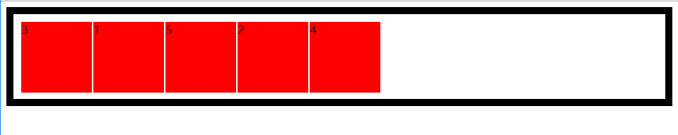
| box-ordinal-group | 设置元素的具体位置 |
|---|---|
1 |
|
混序排列
1 |
|
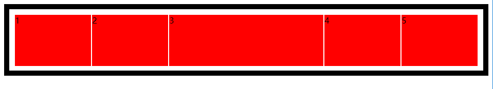
box-flex
定义盒子的弹性空间
子元素的尺寸=盒子的尺寸*子元素的box-flex属性值/所有子元素的box-flex属性值之和
例子:
1 |
|
box-pack
对盒子富裕的空间进行管理
| start | 所有子元素在盒子左侧显示,富裕空间在右侧 |
| end | 所有子元素在盒子右侧显示,富裕空间在左侧 |
| center | 所有子元素居中 |
| justify | 富裕空间在子元素之间平均分布 |